Robert Cox and Matt Bliss did a thoughtful renovation of their 1920s home to turn it into a comfortable space for their young family.
by Ayn-Monique Klahre | photography Trey Thomas

It sort of happened by accident, the purchase of this house. Robert Cox and Matt Bliss had passed by it a number of times on their walks around Hayes Barton, and one day they noticed a “For Sale” sign. “We thought, we’ll just look into this… and after some back and forth, we wound up getting it,” says Cox.
The 1929 home had originally been built as a duplex and converted to a single-family home in the 1970s, with a few additions and changes made in the meantime. But it had sat empty for a few years, without even the front door locked. Water damage, rotting wood and aging surfaces were evident from the get-go.
“What we ended up with was a house with no heat and no AC; the electrical was largely shot and the plumbing was off — we had to do a gut renovation,” says Cox.
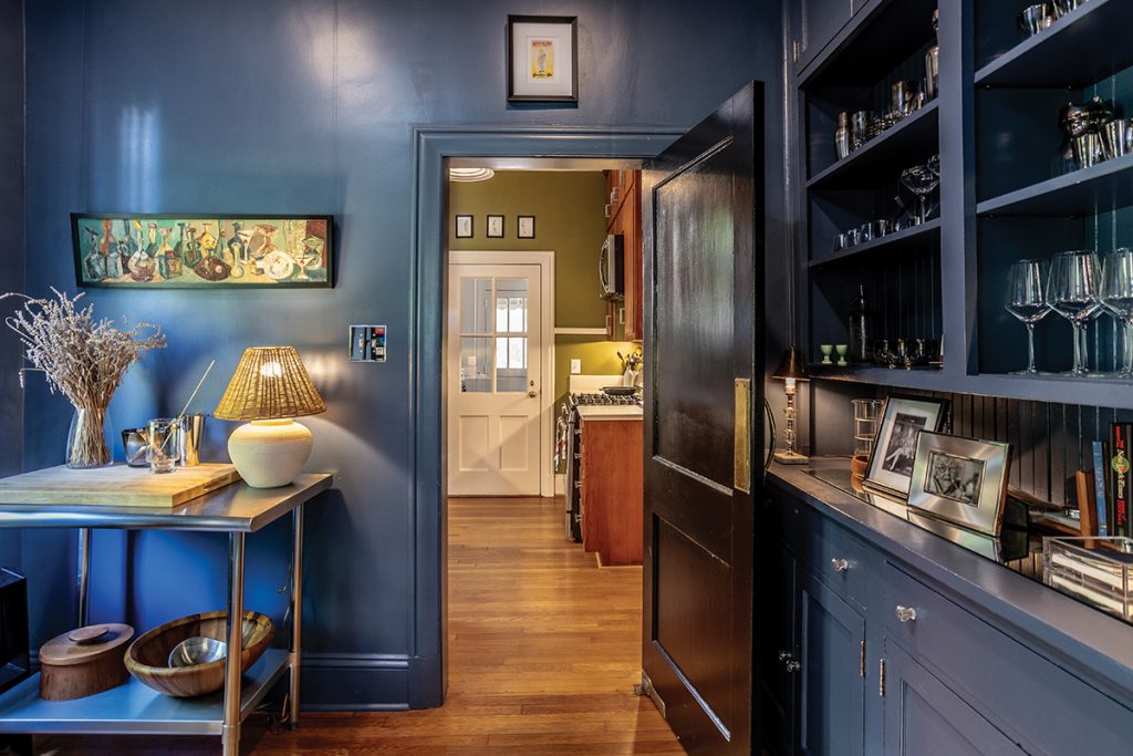
So the couple set about peeling back the layers — removing old wallpaper, lifting up linoleum that covered hardwood, undoing wonky additions — to make the home their own. They leaned into some of the home’s quirks, like the pink-tiled bathroom and stone wall in a first-floor addition, and made small renovations to get every space more functional.
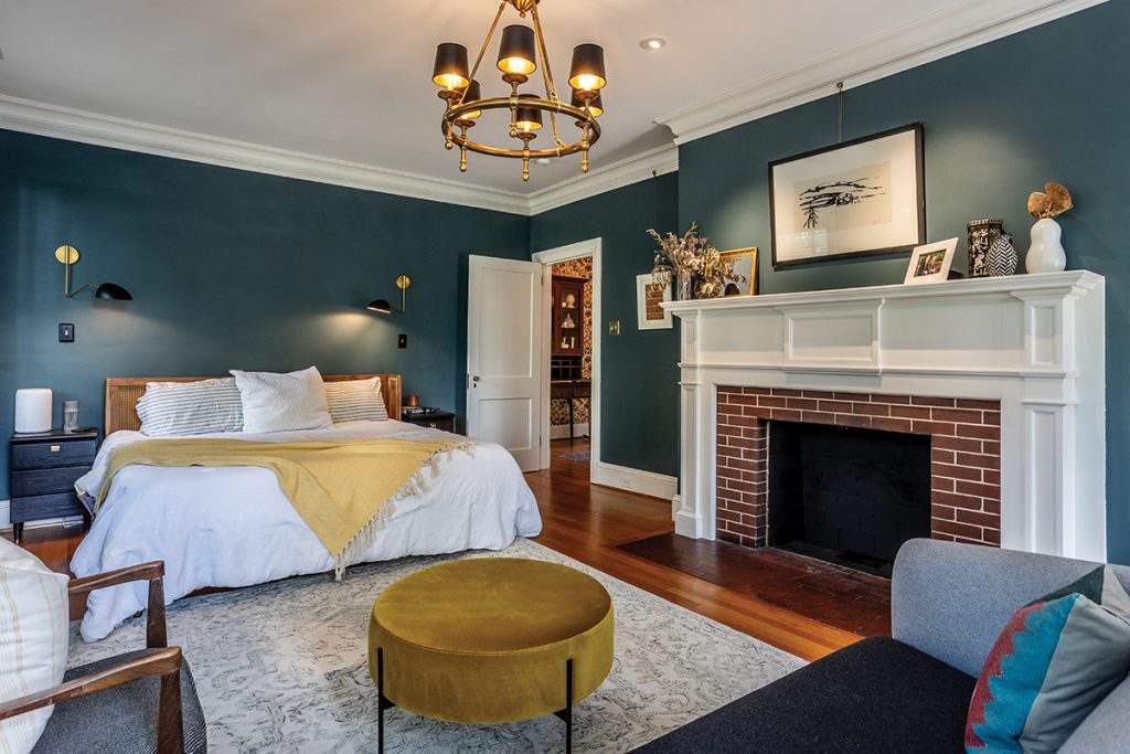
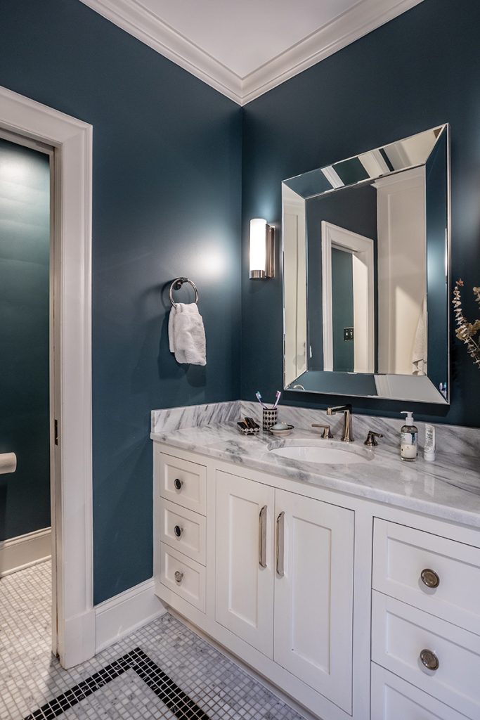
Cox, an architect, designed the plans for the biggest major structural change they made: breaking through the back of a closet to connect their bedroom to a bathroom to complete the primary suite. “We didn’t move any walls; it was more of a surface incision,” Cox says.
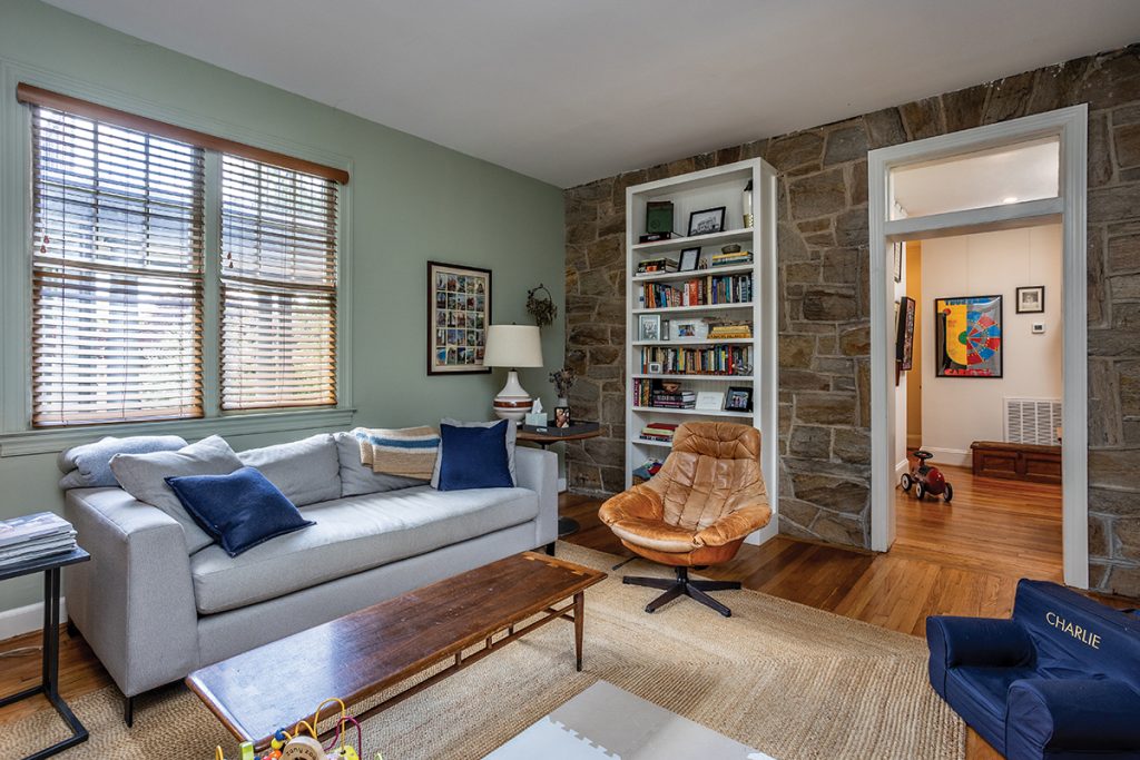
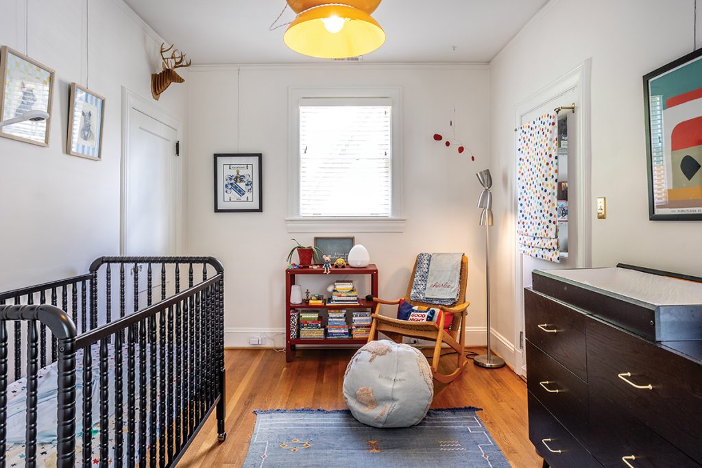
Downstairs, they stripped out a half bathroom and closet from an 1990s-era addition to convert a bedroom into a family room for themselves and their toddler son, Charlie. They also removed aluminum-and-glass paneling from the adjoining porch to restore it to its original, open-air glory. “It felt too closed off before! We love to sit on our porch and chat with neighbors walking by,” says Bliss.
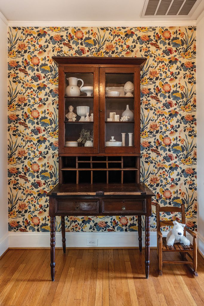
In nearly every room, they removed multiple layers of wallpaper to get down to the home’s original plaster. “Some of it was magnificent — we uncovered one paper that had hand-painted dogwood flowers on it — but most of it was in bad shape,” says Cox. “We also spent a lot of time surfacing and restoring the plaster. That’s why we have picture rails now; we’re committed to not putting any more holes in the walls!” They were able to keep the wallpaper in one spot, a bold floral print at the top of the landing to the second floor.
The overall decor scheme is eclectic, a mix of vintage pieces, art and decorative items found on travels and gathered over time. “A lot of things in our home come from both of us just wanting to poke around an antique store without anything in particular in mind,” says Bliss. “Not even capital-A antiques stores, but junk stores.”
One of his favorite pieces is a modular candlestick that’s currently on display on the mantel. “I have such a collector gene,” says Bliss. “I’ve picked up pieces to add to that all over Europe — in Paris, Amsterdam. Whenever I travel I keep an eye out for pieces.” Around here, they love browsing Pigfish Lane, Union Camp Collective, Raleigh Vintage, Aisle 3 Modern, Hunt & Gather and Trunk Show. “There is so much amazingly built furniture that needs a new home,” says Cox.
Their efforts have turned this nearly 100-year-old home into a comfortable space that feels collected but unfussy. “We love the idea of giving something old a new life,” says Cox.
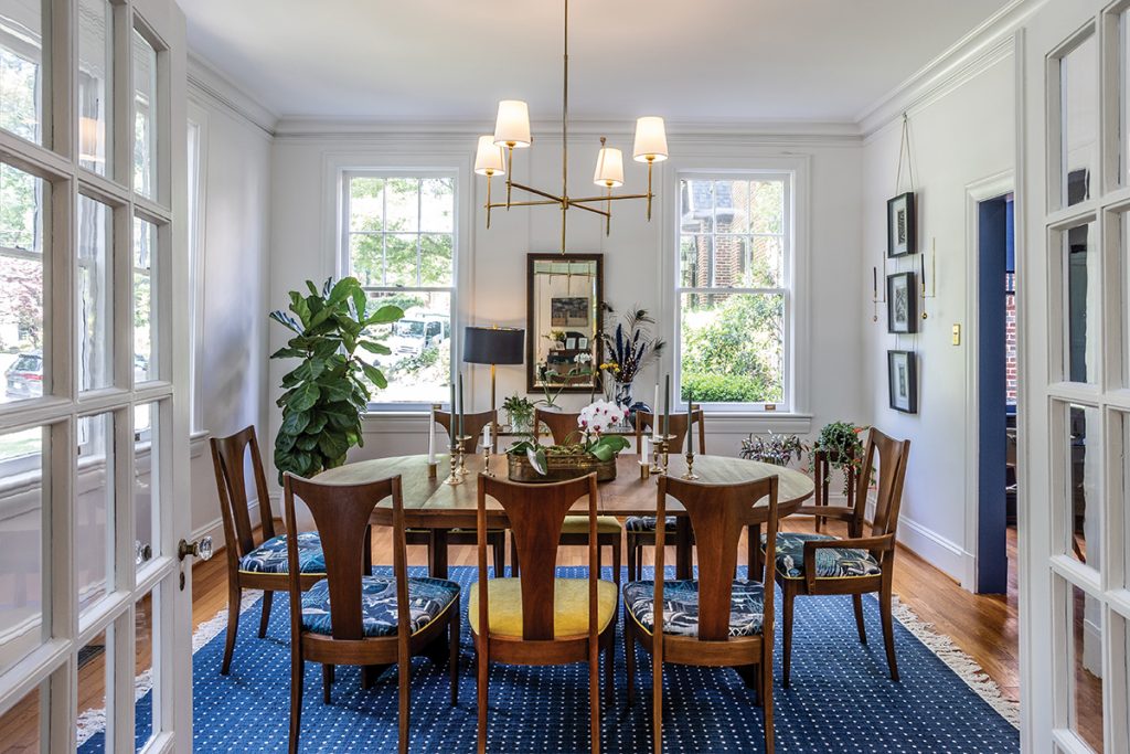
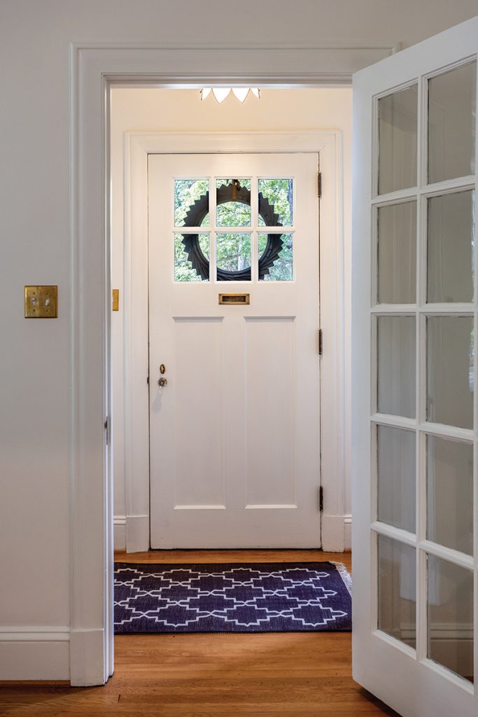

Starting from the front door, the whole house has been updated, including restoring aging plaster and refreshing the woodwork and floors. Cox and Bliss took advantage of NC Historic Preservation tax credits to do the renovation. “One of the first things that drew us to the home was the huge windows in the front room (right),” says Cox. “It gets such great light!” Here, they include a pair of Mid-century modern chairs that had belonged to Bliss’s grandparents, as well as art collected from various sources. “I was a history major, so I love having older art in the house,” says Cox


Bliss and Cox embraced the 1950s-era pink tile in the downstairs bathroom. “I say, don’t fight the house, let’s just celebrate what’s there! We painted the whole room pink,” says Cox. Says Bliss: “Honestly, it makes your skin look so good!” That room also has the original cast-iron tub and enamel sink, and they chose new fixtures and fittings to keep with the original vibe. They created a gallery wall in the hallway that connects the kitchen to the family, dining and living rooms. “With all the art that we’ve collected and continued to collect, it’s nice to have a big open space that we can play with,” says Bliss.
This article originally appeared in the September 2024 issue of WALTER magazine.


