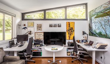
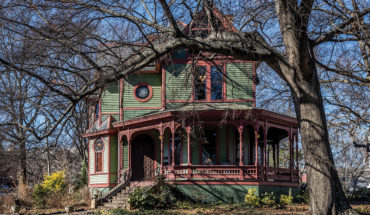
Chapel Hill architect Phil Szostak is known for designing airy, light-filled commercial and residential spaces around the Triangle.
by J. Michael Welton

At the Hermitage Court House in Durham, Szostak paid close attention to the volume and scale of traditional residences around it, while speaking in a modern language. | Photograph by Jim Sink
A good word to describe Chapel Hill architect Phil Szostak: generous. It applies to his relationships with his peers, his clients and the communities he serves. It manifests itself physically, in some of the most pristine, light-filled and wide-open spaces in the Triangle today. And it’s the reason his classically modern buildings—public and private alike—seem built for the ages. “Phil has a real love for design, and he shares his passion with others,” says Bryan Bell, associate professor of architecture at N.C. State University’s College of Design. “You see it in his details, designs and materials.”
Bell came to know Szostak through a platform the older architect helped create. In 1992, Szostak and seven other local designers—Roger Clark, Kenneth Hobgood and Frank Harmon among them—came together monthly to critique each others’ unbuilt work. What started as an informal peer review called the Triangle Area Design Society (TADS) has since grown into a fountain of camaraderie, and a forum where architects can explain, explore and defend their designs.
Bell arrived in Raleigh in 2000 to teach at the College of Design. Soon enough, he and his wife Victoria, also an architect (and author of the recently published Triangle Modern Architecture) were invited to a TADS crit session. “One of the wonderful things about this community is how welcoming it is,” he says. “Phil was the organizer behind that group, and it gave us an idea of who the architects to be admired were around here.”
Among them are designers who articulate a distinct modern vernacular they learned at N.C. State University’s School (now College) of Design, known as the Carolina School. Distinctive characteristics of this style of architecture include a thoughtful response to site and landscape, a celebration of natural light and an exploration of the relationship between volumes within volumes. It may have started decades ago, but it’s still being taught at the college today.
Szostak entered the School of Design in 1971 and graduated in 1975. That places him among the last to attend classes there while Henry Kamphoefner, its founder, was still an active dean. (Kamphoefner transitioned to dean emeritus in 1973.)

His clients wanted their Hathaway Road home to be timeless, one that in 100 years would still be respected as beautiful piece of architecture. | Photograph by Jim Sink
Szostak’s been practicing since he graduated. He started out with Newberry Ashford (now defunct), then established his own Chapel Hill firm in 1980. By 1990 he was named North Carolina principal for NBBJ, the nation’s second largest architecture firm. Twelve years later, he went back out on his own.
Since then, he’s been working on every kind of commercial, cultural and residential project imaginable, from small additions to multi-million-dollar designs, including Raleigh’s recently expanded Capital Broadcasting headquarters and N.C. State’s new equine research center. They all adhere to the tenets of the Carolina School architectural style, and most share another common trait: they’re often bright-white beacons in their respective environments.
Nowhere has Szostak expressed his work better than at the Durham Performing Arts Center, built in 2008. It’s thrifty, practical, transparent—and stark white in color. And truth be told, it might not exist today without the architect who also served as its developer. “It was just about dead, and Phil stepped up and said, ‘I’m going to make it happen and deliver more than the client asked for,’” says Frank Harmon.
To bring it to life, Szostak personally sought sponsors and served as co-guarantor for its financing, along with his team of developers. Today, DPAC is a performing arts center that—with a total cost of $47 million, including his fees—is the least expensive of its type in the nation. That’s because it’s architect/developer built only what he could raise funds for. “I was ruthless in what we spent money on,” Szostak says. “Basically, it’s sheetrock inside. The halls are bright red and everything else is bright white.”
Its interiors may be painted wallboard rather than gleaming marble, but its exterior is a stunner. The building’s essentially a giant Japanese lantern, one that beams across downtown Durham at sunset. “The window wall at DPAC makes that building,” says Harmon. “It looks like a giant crystal at night.” It was a labor of love and a gift to Durham, one that consumed most of Szostak’s time during five years of meetings with Durham City Council. Among those sitting in on an early design presentation to the council was Brad Brinegar, chair (and former chairman and CEO) of Durham-based ad agency McKinney. The two discussed value engineering for the theater, and found they were in sync. “I’d like to think I helped maintain the integrity of Phil’s design in the face of budgetary challenges,” Brinegar says.
Soon enough, Szostak was designing a new home for Brinegar and his wife Missy on the golf course in Durham’s Hop Valley. “We wanted a retreat,” Brinegar says. “But also something timeless, something that could have been built either in 1930 or 2050.”
Now they live in a Szostak-designed home that’s essentially an art gallery with a studio where Missy, an artist, can paint. The interior is flooded with natural light from floor-to-ceiling windows, with views past the terrace and pool out to the third hole of the golf course.
Here, Szostak’s use of planes and volumes turned his simple material palette—he likes to economize with oversized, inexpensive bricks painted white—into an exploration of opacity and transparency. “We have this huge front entrance, but I enjoy privacy, so he came up with these stunning walls outside,” Missy Brinegar says. “They create a space where there’s no difference between indoors and outdoors.”
Szostak repeated the concept at a home for Elisabeth Benfey and her husband, Philip, on a 52-acre property on Old School Road in Chapel Hill. Benfey, a film instructor at Duke, wanted open sight lines to the surrounding landscape from inside her home. “This house allows me, from dawn to night, to be outdoors with all the comforts of shelter,” she says of her floor-toceiling windows.
Like the Brinegar residence, the exterior of Benfey’s home is pure white. Its design is the result of ample back-and-forth discussions between clients and architect—collective, collaborative and challenging. “It looks simple, but it’s complex,” she says. “One day he pulled out an all-white Rubik’s Cube, which I thought was hilarious: he designed a home with a white Rubik’s Cube in mind.”

House in Hope Valley in Durham, architect Phil Szostak designed an entry that opens up to a gallery that organizes the home’s interior layout. | Photograph by Jim Sink
For Nita Farahany and Thede Loder in Durham, Szostak respectfully inserted a white, two-story house into a lot surrounded by a subdivision’s more traditional residences. The new home’s scale and proportion align with those around it, but it’s a distinctly modern Szostak design.
Looking out toward the street, the house succeeds largely because of how the architect addressed window placement and landscaping. “You look out and see the top of the trees, like you would in the country,” Szostak says. “It changes how you feel about the site by changing your perspective, because the view is up to the sky, versus looking out to traffic.”
Elsewhere in double-height spaces, sunlight slashes down from clerestories and pours through floor-to-ceiling windows. “He took time to study where the sun rises and sets,” Farahany says. “The kitchen is an amazing place to be in the morning and the master is oriented to the south-facing light, and there are great, wide-open spaces for our young children.”
As Harmon says, Szostak’s an architect with a gift for seeing the bigger picture. And now, with the recent passing of giants like Phil Freelon and Steve Schuster—and Harmon’s own retirement—the 66-year old Szostak is squarely positioned as senior statesman for today’s practicing Carolina School.
As such, one can only hope that his vision will continue to inspire us with wide-open spaces for years to come.


