The Bailey family enlisted architect Nick Hammer to design a home in Oakwood that bridges their contemporary aesthetic with period nods.
by Ayn-Monique Klahre | photography by Keith Isaacs
As their two sons got older, Rachel and James Bailey were ready for more space — but as longtime, loyal residents of Oakwood, they weren’t ready to give up on their friends or the benefits of being downtown. They hit the jackpot when they found a 1.5-acre lot just on the northern edge of the neighborhood. “We loved the proximity to so many of our favorite places, like Yellow Dog Bread Co., Person Street Bar and Two Roosters,” says Rachel. And, says architect Nick Hammer, “When you find a big lot for sale in Oakwood, you don’t pass it up.”
There was a 1940s bungalow on the lot, which had only ever been owned by one family. “Initially we thought we’d renovate,” says James. But after a structural engineer declared the home “soft” upon inspection, with lots of mold and mildew, they realized they would have to start fresh. “It was to the point where the inspector wouldn’t even go into the crawlspace,” says Hammer. “Everything was waterlogged.”
Since they were starting from scratch, the Baileys enlisted Hammer, a friend and neighbor (who, it turned out, had gone to Broughton High School around the same time as James). They also knew they wanted to work with builder Jonathan Graban of J.W. Builders, another neighbor who had collaborated with Hammer on several projects the Baileys admired. “As a duo they were really attractive because their work as a design-build team is so integrated,” says James.
The initial conversations were fairly broad. “We had a rough idea of what we wanted — bedrooms for both kids, enough bathrooms — but weren’t set on any one thing,” says James. “Our taste leans modern, and we wanted something that felt like us, but also like part of the neighborhood.”
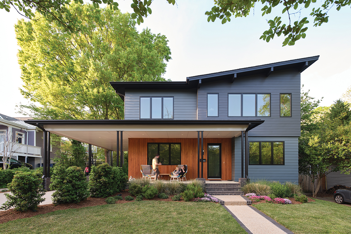
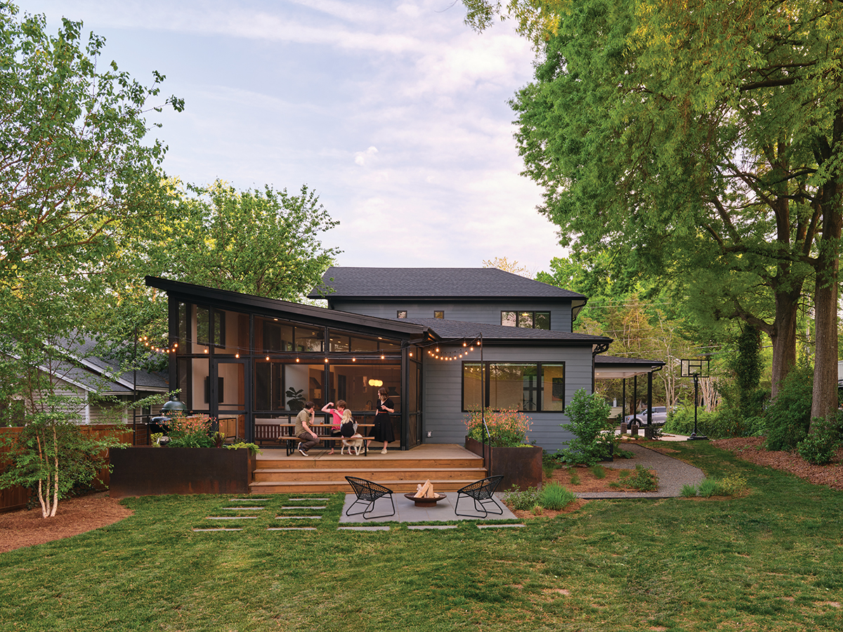
As someone who’d worked in the area a lot, Hammer understood the directive: “They didn’t want to push the limits or do something that would make people unhappy, so we agreed we’d go more modern in the interior but look to the neighborhood for the exterior design.” To that end, the front elevations take cues from other nearby homes, as do treatments like the horizontal lap siding, exposed rafter supports and a porch that connects to the carport. The footprint of the home is not much bigger than the original, and the massing of the house — two stories in the front, one story in the back — is consistent with Oakwood designs. Even the sharp angle on the southwest corner of the roof is a nod to neighboring structures. “In Victorian architecture, you find these peaked attics with windows or circular turrets with pointed roofs,” says Hammer.
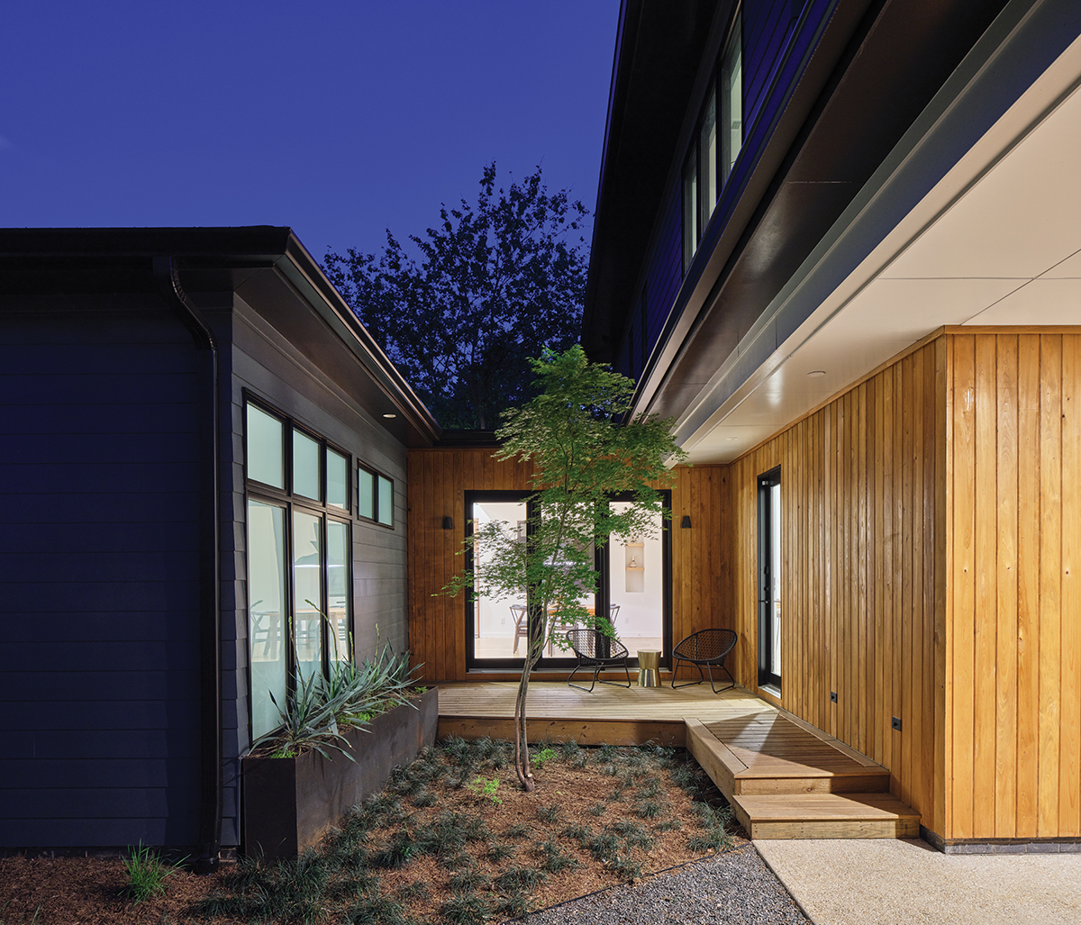
They also needed to respect the large, mature trees in the yard. “There was a very clear critical root zone that we wanted to protect,” says Hammer. To do so, he designed a courtyard-style cutout at the side of the house that serves as the friends and family entrance. James was impressed with the resolution: “Nick turned what could have been seen as a problem into an awesome feature.”
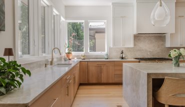
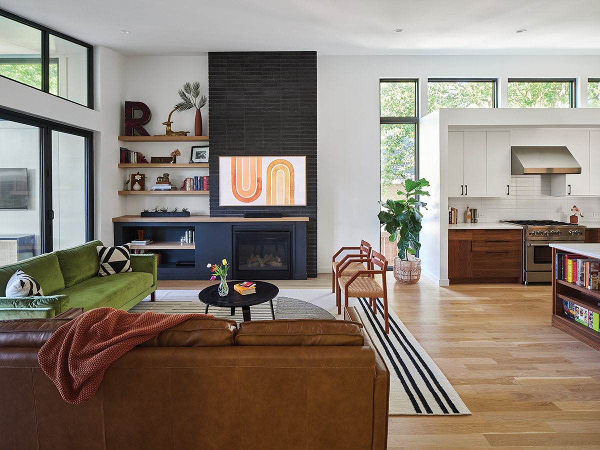
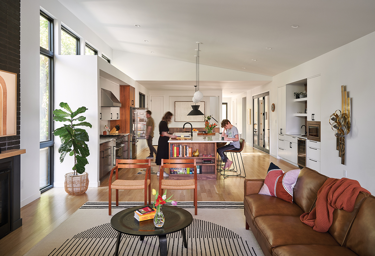
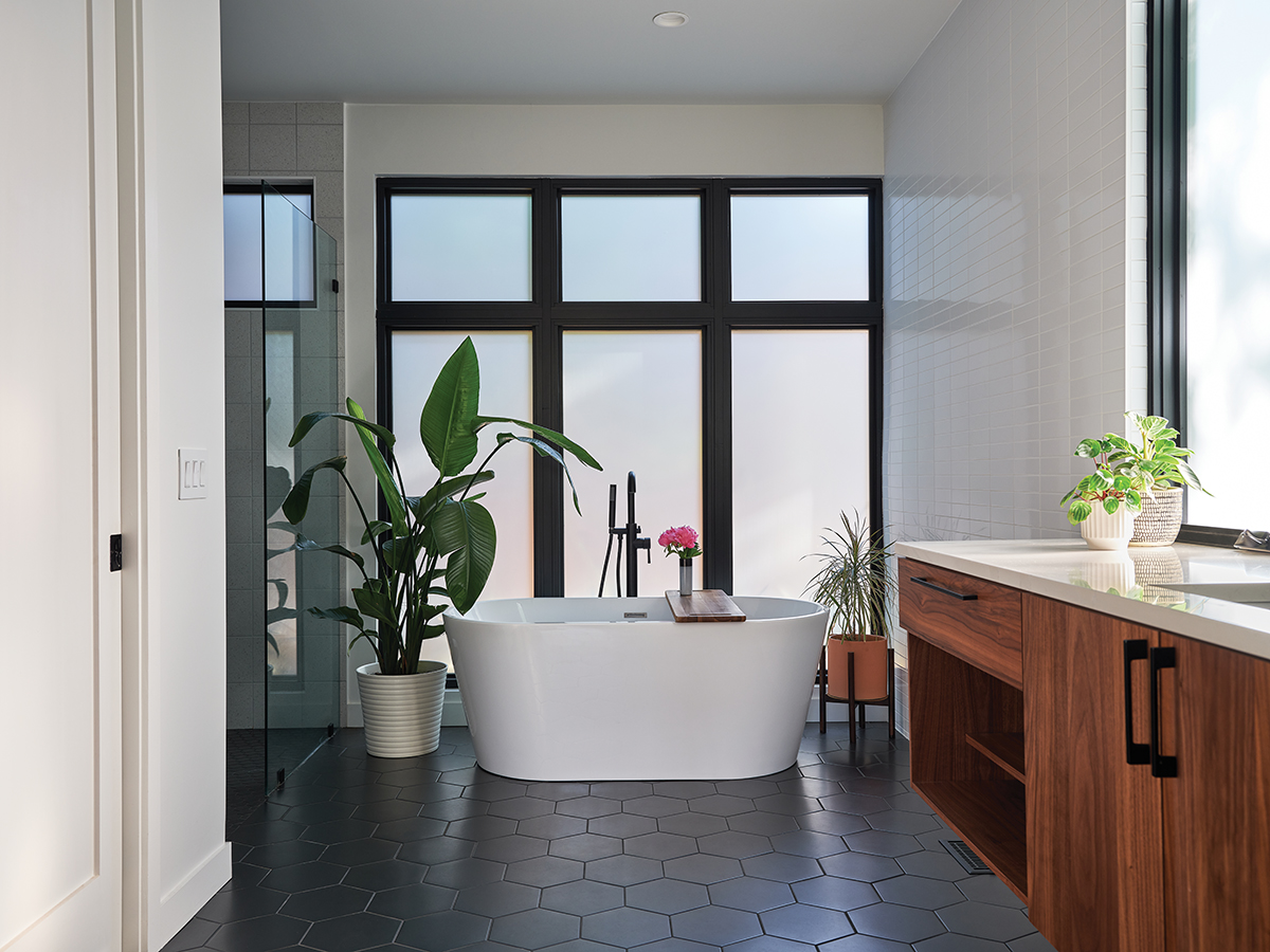
Inside, the home is much more modern, with a wide-open floor plan, huge windows, high ceilings and clean trimmings. From the front door, you can see straight to the back yard. “I just love the uninterrupted view all the way to the back,” says Rachel. “It doesn’t take that many steps before you are in this big, open concept space.”
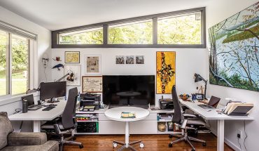
To the right and left just inside the front door are James and Rachel’s offices (hers also functions as a guest room), each with big windows into the front yard. “James knew he would be working from home, so he wanted to be able to see the streetscape and passersby,” says Hammer.

Moving deeper inside, the hallway leads to a large, open room with the dining area, kitchen and living area at the back. A giant kitchen island holds court in the middle of that space. “I love the big island, I joke that it’s a house-sized coffee table,” says James. Here, the family eats casual meals, does work and homework, and comes together for crafting or games — sometimes, all at once. “We hosted Thanksgiving, and we had people doing a puzzle on one corner, mashing potatoes on another and then watching the game nearby in the living area,” says Rachel. “It was amazing that we could all have our own space, but also be together in this harmonious way.”
There’s a seamless transition from indoors to outside. “James and Rachel had a clear vision — the backyard was such a motivation for buying the lot,” says Hammer. He designed a space that opens from an interior room to a semi-conditioned screened-in porch, an open deck, then a patio and yard beyond.
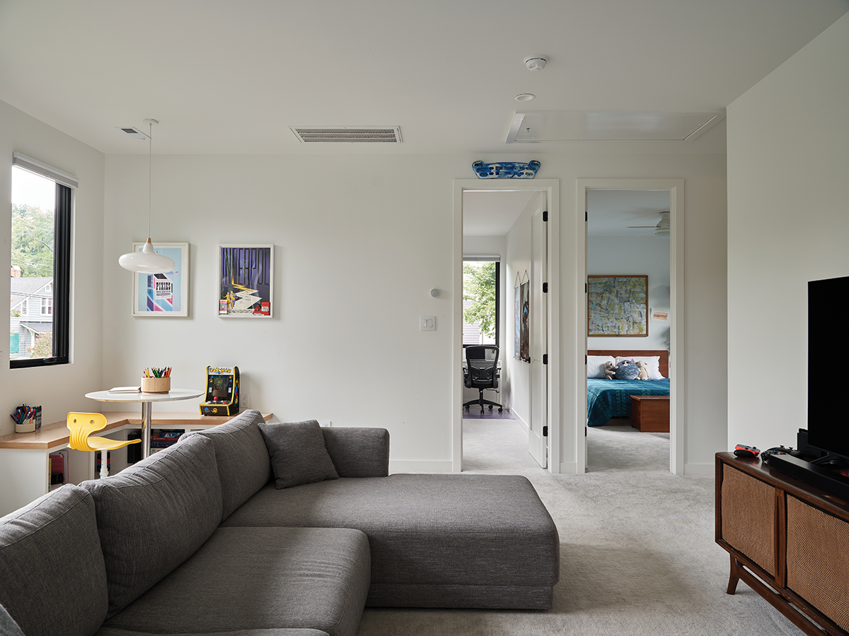
The primary bedroom is off the living area. “We have an amazing view of the trees and the backyard,” says James. The kids’ area is accessed by stairs just off the kitchen; up on the second floor, they have a common area, bathroom and rooms for their two sons, Mack and August.
The second floor is only in the front of the house, a conscious decision for a few reasons: It nods to existing architecture in Oakwood, adds only the extra space they wanted for the kids and is closer to the volume of the previous home. “By keeping the pitch ceiling low and back half lower, we were able to preserve the afternoon light that the neighbor was used to having,” says Hammer. “We were trying to be considerate and think about the impact of building a larger house. We didn’t want to be a looming presence.”
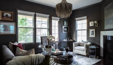
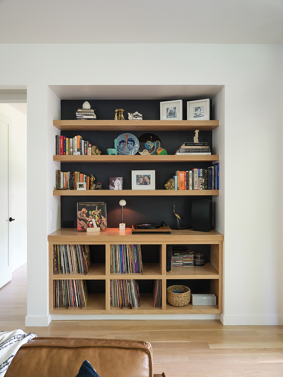
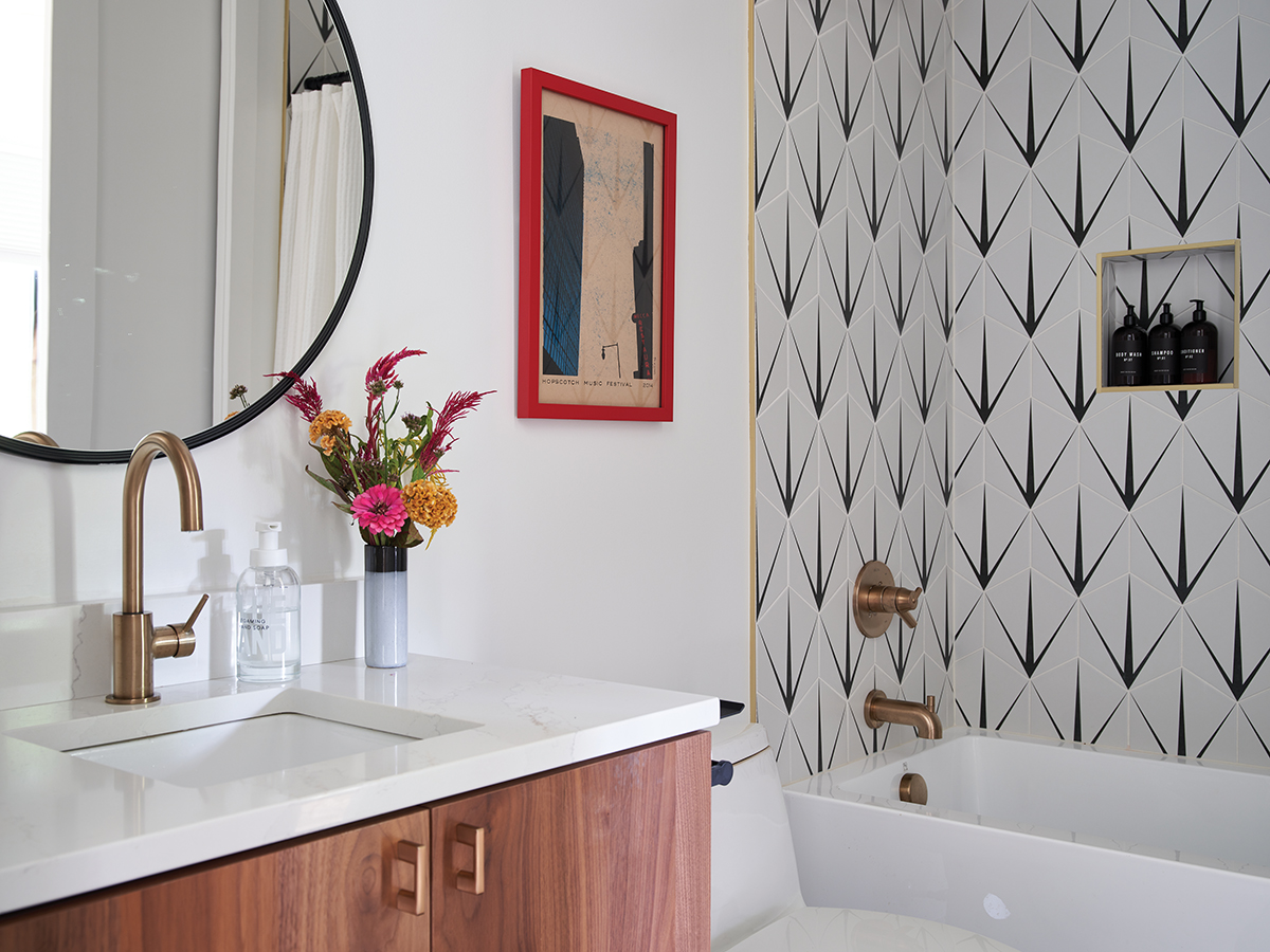
The Baileys decorated the home with contemporary and Mid-century pieces, many found at local vintage stores, in a palette of black, white, wood and brass.
Overall, the footprint of the new house was not much bigger than the original, but the space feels both modern, modest and of the moment. “We feel like we found the balance: a contemporary home that fits within the fabric of Oakwood,” says James.


This article originally appeared in the October 2022 issue of WALTER magazine.