Get to know the graphic designer who creates the look and feel of some of Raleigh’s most popular food and beverage spots
by Colony little | photography by Joshua Steadman
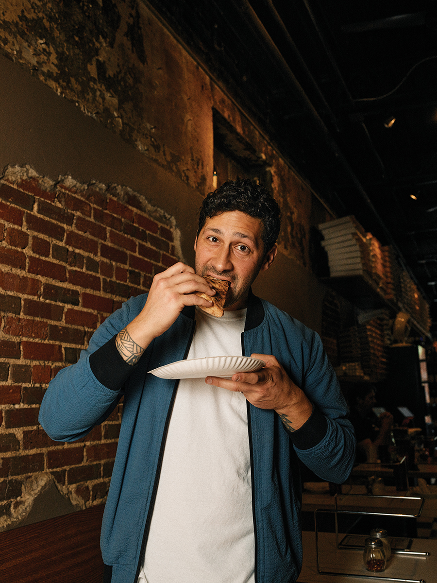
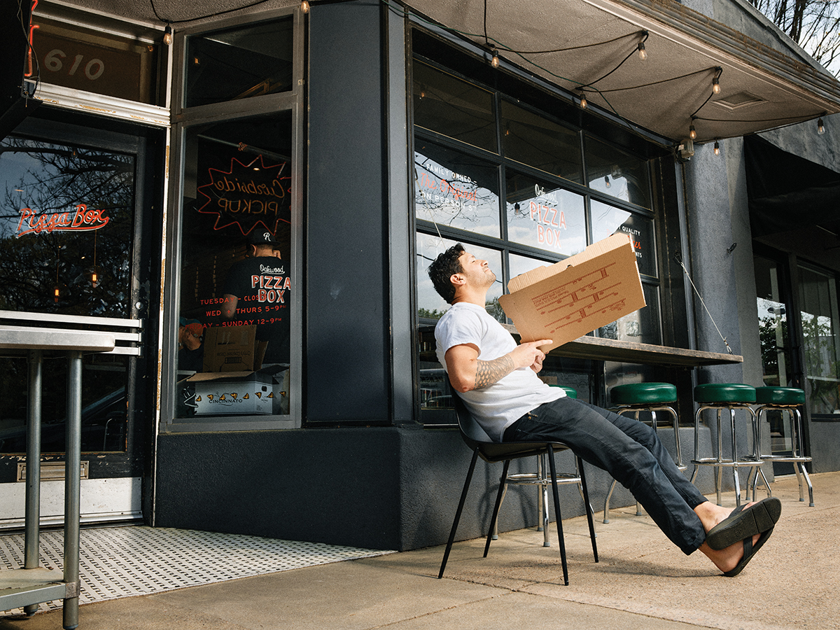
When design is well executed, it tells a story — it creates a visual language that sets the tone for an experience. And in the competitive world of hospitality, first impressions can make or break a brand. Paul Tuorto is one of the people shaping the first impressions of bars and restaurants around Raleigh. If you get excited about that blocky “Union Special” stamped on the brown bag holding your sourdough, or are tickled when you see the video-game monster gobbling up pizzas when you bring home a pie from Oakwood Pizza Box, you have Tuorto to thank.
“Chefs are really creative people, they’re dreamers,” Tuorto says. It’s this art director’s job to turn that dream into a world of visuals that tells a brand’s story from first glance.
Growing up in Long Island, New York, Tuorto’s home was full of Italian food, music and creativity. His mother is a self-taught interior designer, his father studied art in college, and Tuorto and his two brothers were encouraged to play multiple instruments in school.
When he was 10 years old, Tuorto’s family moved to Cary for his father’s work. Tuorto had always loved drawing, and it’s around that age that he remembers being drawn to logos for surf and skate brands like Billabong and Quicksilver. “I specifically remember the Hawaiian Island Creations logo, I drew it on everything,” he says.
It was in an AP art class at Green Hope High School that Tuorto learned his interest could actually turn into a career. For one assignment, the students were challenged to redraw familiar logos in a pop-art style. “I made a three-dimensional version of this turtle design on a t-shirt I loved, then got curious about who made the original,” Tuorto says. His teacher explained that it was probably a graphic designer. “I asked, What’s that? And when she explained it to me, I thought, That’s a thing?” he says. He’d found his path.
Tuorto attended Appalachian State University, graduating with a degree in graphic design. He returned to the Triangle in 2007 and began working in a design firm, but when the economic collapse hit in 2008, his position was cut. He started freelancing, taking on design gigs and contract work to pay the bills, but he wasn’t passionate about the clients. “It was not rewarding at all,” he says. “I needed some other outlet to do something creative.”
So he started a food blog called GiustoGusto (it means “right taste” in Italian). “It was mostly recipes, along with monthly musings on favorite destinations, markets, products, that sort of thing,” he says. “And it led to some really fun collaborations and opportunities.” Through the blog, he ended up meeting people in the hospitality industry who would become both mentors and future clients, like Pizza Box’s Anthony Guerra, the award-winning restaurateur Scott Crawford and Trophy Brewing’s Chris Powers.
In 2011, Tuorto went back in-house, joining creative advertising agency Baldwin& as an art director. There, he says, he strengthened his account and project management skills working with corporate clients like Burt’s Bees and BMW. The process of pitching concepts and working with demanding clients challenged Tuorto and gave him an opportunity to grow. “You learn about selling your work in school — the process of sharing your decision-making is part of the crit — but it’s very different when you’re trying to sell things that have large dollars connected to them,” he says. “It makes you think about things completely differently.”
After five years with Baldwin&, Tuorto went out on his own. (He didn’t leave the agency too far behind; he still rents a desk at their office in the Warehouse district. “It’s always been a wonderful atmosphere,” he says.) The move coincided with a renaissance in downtown Raleigh. “It was absolutely flying — every week somebody was talking about a new opening, especially restaurants, and it was always in the back of my mind that the projects I liked most at Baldwin& were ones that were related to hospitality or the service industry,” he says.
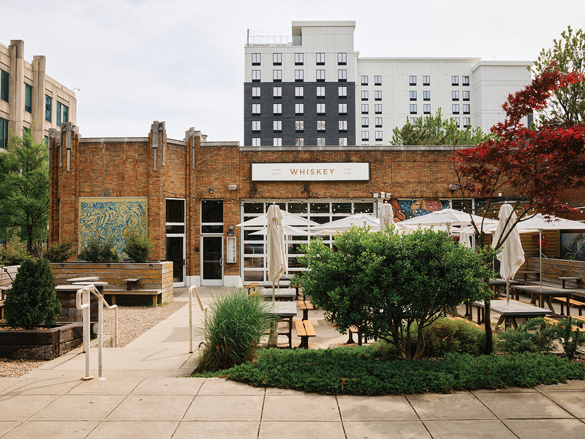
In his solo practice, Tuorto synthesized his skills and interests in the restaurant industry more deliberately, working with friends and colleagues he knew in town and through his blog. Whiskey Kitchen was Tuorto’s first client on his own. He worked with the owners to orchestrate its design assets, from creating the logo and signage to shaping staff attire and event marketing graphics. That project catalyzed his freelance practice and became the blueprint for the design process with his clients. “It was like a spark plug,” he says. “That was so much fun, and we knew we had something kind of special — I could see the runway ahead of Raleigh, and how many of these establishments were going to happen in the area.”
Each of his projects follows a similar process of discovery, strategy and design, often going through several iterations before finding the final look. Working with Crawford on Brodeto, for example, Tuorto channeled the chef’s love of tattoos and motorcycles, as well as the art found in the areas of Croatia and coastal Italy represented in the restaurant. “I shared several different styles of logotype of hand-drawn typography for the name, as well as illustration styles and ideas for the secondary logomark, the octopus,” he explains. “Once we landed on a mosaic style of type, I worked with a mosaic artist in New York to create it out of tile. We photographed the mosaic and turned it into a working logo file for the restaurant.”
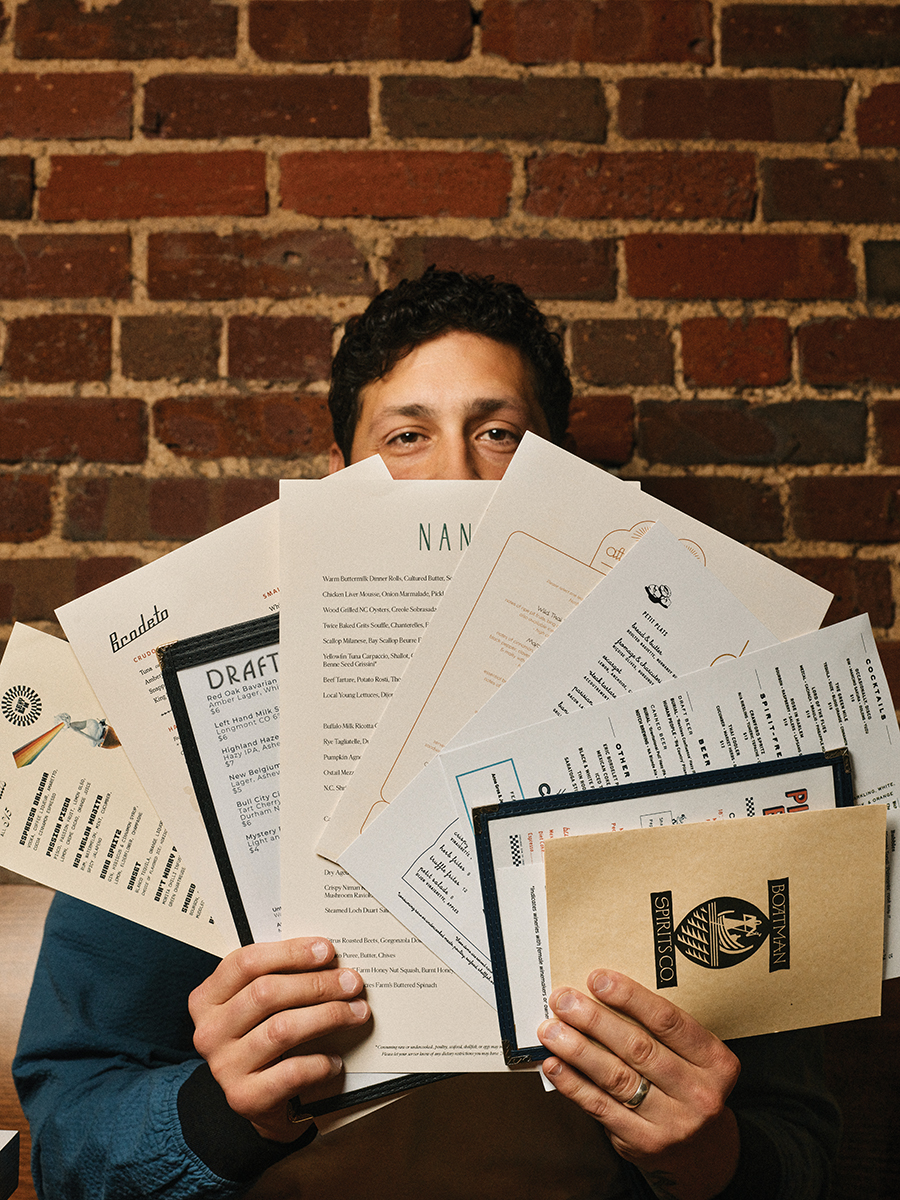
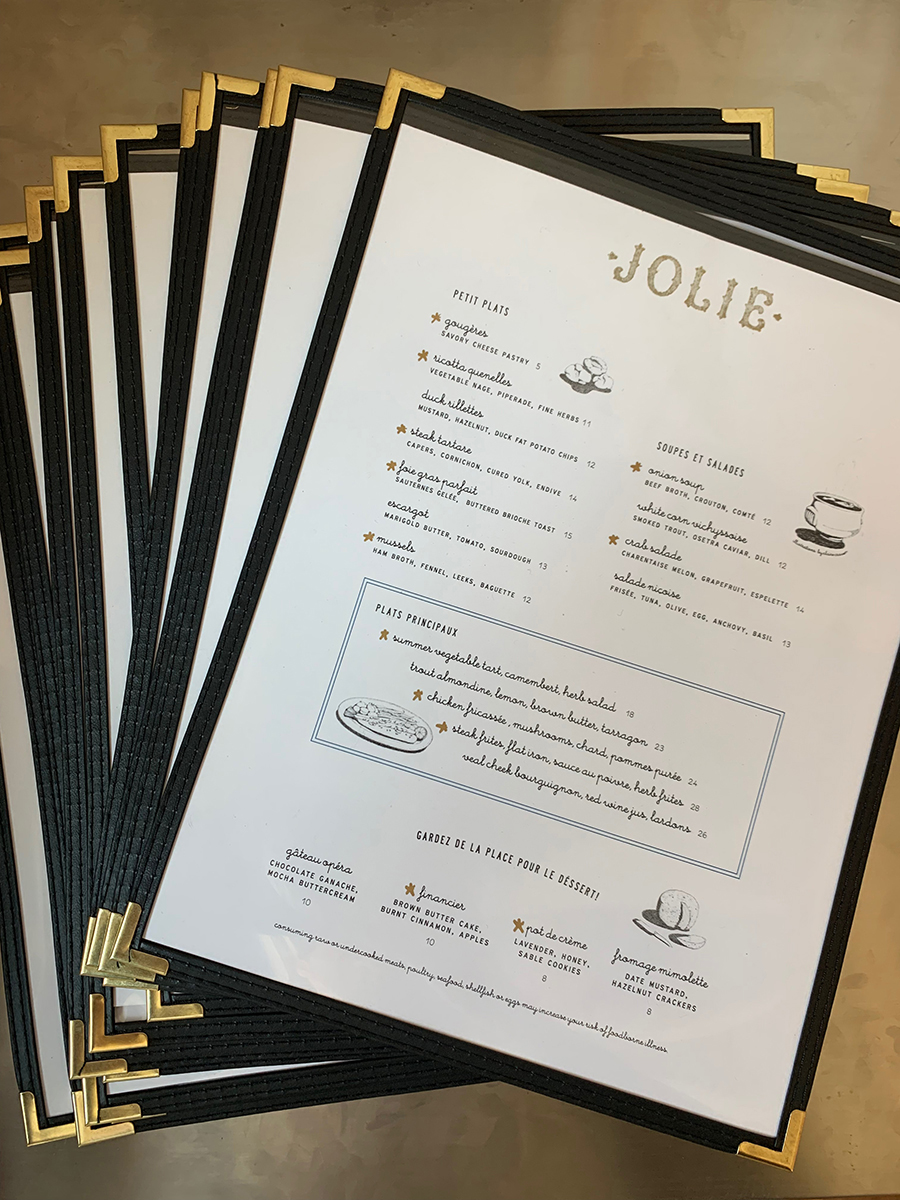
Once the primary identity is established, he develops all of the other visuals, including menus, signage, interior touches like artwork or wayfinding, merchandise, promo pieces and art direction for digital assets like the website and social media.
When Sarah Shepherd and her husband were turning a historic mansion in Boylan Heights into the Heights House Hotel, she turned to Tuorto for guidance on its new visual identity. “Branding is one of the most important steps for a small business,” she says. “Paul took so much thoughtful time to listen to my vision and values and transform what was in my head into a perfect reflection of what we wanted our branding to be.”
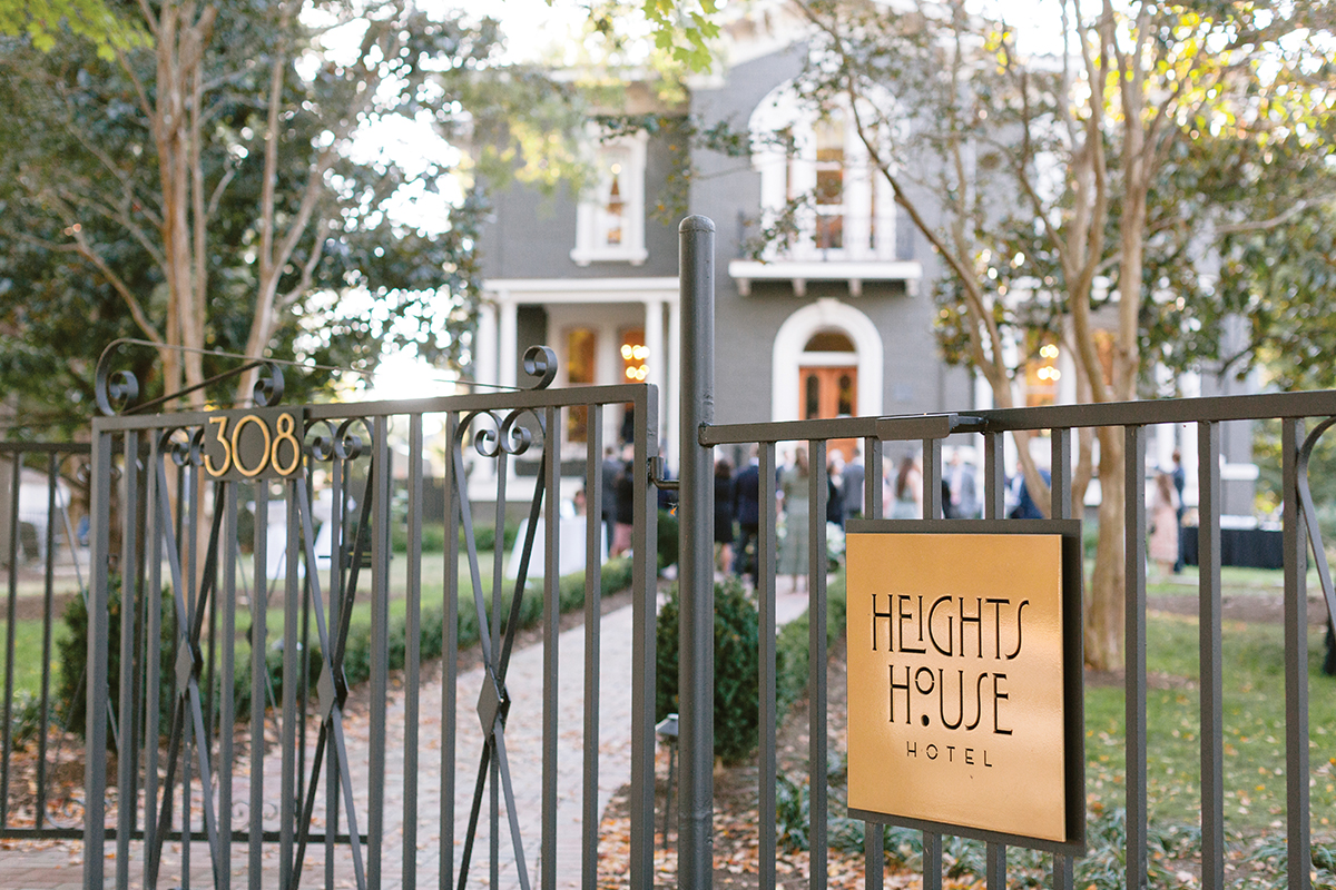
For Heights House, Tuorto designed a minimalist sun and moonbeam logo that replicates the shapes found in arcs of the building’s windows. It’s complemented by a custom typographic font called Boylan Neue, a modernized interpretation of the Art Deco style typeface found on signs throughout the neighborhood. Elements of these motifs are found in small details throughout the hotel, from its business cards and stationery to the brass keychains on the room keys and the perfume bottles containing the hotel’s signature scent. “You can build a big experience, think beyond a single logo to build an entire world,” he says. “It gets more rewarding as you stay engaged.” Shepherd has continued to work with Tuorto over the past five years as they’ve created new events and products. “He’s a pivotal extension of our team!” she says.
Entering his 10th year in his solo practice, Tuorto has seen the ebbs and flows in the industry he serves but continues to be inspired by the small businesses contributing to Raleigh’s unique landscape. “It may be selfish, but I love designing for local spots because I get to enjoy them myself,” he says. “People in hospitality pour their heart and soul into what they’re doing, and it’s super rewarding to be a part of these projects.”

This article originally appeared in the May 2026 issue of WALTER magazine.